DAVI Visualizing Geospatial Data
DAVI Visualizing Geospatial Data
Lecture Notes: Geovisualization and Spatial Data Visualization
Announcements
- Project Presentations: Sign-up is open for project presentations in the TA sessions next week or the week after. Opportunity to showcase progress and receive feedback.
- Exam Sign-up Phase 2: If you have obligations during the exam period, email the professor to receive the sign-up link early.
- Office Hour Cancellation: No office hour today due to the professor teaching another lecture.
- Adjusted Schedule: Breaks will be shortened to 10 minutes to end the lecture 10 minutes early.
Recap Quiz on Temporal Visualization
Question 1: Horizon Graphs
- Purpose: Used to show multiple time series.
- Example: Stock prices over time or weather data for different cities.
- Visualization Technique: Compact display allowing comparison across many time series.
Question 2: Time Arrangements
Not a Time Arrangement: Logarithmic time.
Actual Time Arrangements:
- Linear Time: Standard timeline from start to end.
- Cyclic Time: Time represented in cycles, such as clock faces for daily patterns.
- Branching Time: Represents diverging paths, like version control systems (e.g., Git branches).
Question 3: Triangular Model
- Identification: The chart shown is a triangular model.
- Purpose: Visualizes multiple time intervals as points instead of lines.
- Contrast with Other Charts:
- Ternary Plot: Used for three variables that sum to a constant (e.g., 100%).
- Population Pyramid: Shows age distribution across genders.
- Tri-linear Plot: Another term for Piper diagrams in geochemistry.
Question 4: Mapping Time
- Not a Principal Way: Mapping time to pixel.
- Principal Ways of Mapping Time:
- Mapping Time to Space: Using small multiples to show different time points in separate spaces.
- Mapping Time to Time: Creating animations where display time represents data time.
Question 5: Spiral Plots
- Purpose: Used to identify periodicities in data.
- Example: Visualizing recurring patterns in events such as doctor visits or weather phenomena.
- Technique: Adjusting the spiral to match the period of interest (e.g., weekly cycles).
Geo-visualization
Introduction
- Origin of Visualization: Geo-visualization, or thematic cartography(专题制图), is considered the origin of visualization.
- Fundamentals: Many visualization principles, such as the use of marks (points, lines, areas), stem from cartography.
- Importance: Understanding geovisualization is crucial due to its widespread application and foundational concepts.

Challenges in Geo-visualization
Misrepresentation in Maps
- Example: The Mercator projection distorts areas, making regions near the poles appear larger.
- Consequence: Can lead to misconceptions about the size and importance of different regions.

Election Maps and the Modifiable Areal Unit Problem (MAUP)
- Issue: Traditional election maps may misrepresent data due to varying area sizes of regions.
- Example: A large area with a small population may appear more significant than it is.
- Solution: Use cartograms or other visualization techniques that adjust for population or electoral influence.


Trade-offs in Visualization
- Expressiveness vs. Effectiveness: Balancing accurate representation of geospatial context with the clarity of data presentation.
- Expressiveness of Data Context vs. Data Content: Deciding whether to prioritize geographical accuracy or data accuracy.

Map Projections
Purpose of Map Projections
- Challenge: Representing the 3D Earth on a 2D map introduces distortions.
- Types of Distortions: Area, shape (angles), and distance.
Common Map Projections
Mercator Projection
- Characteristics:
- Preserves angles (conformal).
- Distorts areas, especially near the poles.
- angle(角度)指的是地球表面上两条相交线之间的夹角
- 当地图投影被称为conformal(保角投影)时,意味着它在局部范围内保持了这些角度的准确性。
- Use Cases:
- Nautical navigation: Straight lines on the map correspond to constant compass bearings.
- Online maps (e.g., Google Maps) for local navigation.

Mollweide Projection
- Characteristics:
- Preserves area (equal-area).
- Distorts shapes, especially at the edges.
- Use Cases: Representing global distributions where area accuracy is important.

Azimuthal Equidistant Projection
- Characteristics:
- Preserves distances from a central point.
- Distorts areas and shapes elsewhere.
- Use Cases: Radio and seismic mapping from a specific location.
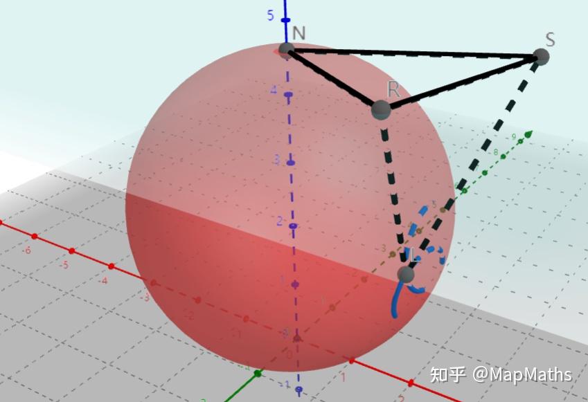
Evaluating Projections with Tissot’s Indicatrices
- Technique: Placing identical circles on the globe to visualize distortions when projected onto a map.
- Interpretation:
- Size Changes: Indicates area distortion.
- Shape Changes: Indicates angular distortion.

Quality Criteria for Map Projections
- Angle Preservation (Conformal): Shapes of small areas are preserved.
- Area Preservation (Equal-Area): Relative sizes of areas are maintained.
- Distance Preservation (Equidistant): Distances from a central point are accurate.
- Note: It’s impossible to preserve all three simultaneously; projections must compromise based on use case.
Types of Maps in Data Visualization
Dot Maps - POINTS
- Usage: Plot individual events or occurrences at specific geographic locations.
- Example: Locations of disease outbreaks or crime incidents.

Heatmaps - POINTS
- Purpose: Visualize the density of points in an area to address overplotting in dot maps.
- Example: Population density or Wi-Fi signal strength in an area.

Flow Maps - LINES
- Usage: Show movement or connections between locations using lines or arrows.
- Example: Airline routes or migration patterns.

Choropleth Maps
- Characteristics:
- Data is mapped onto predefined regions, such as political boundaries.
- Uses color shading to represent data values.
- Appropriate Data: Data that is aggregated or inherently linked to regions (e.g., election results).

Isopleth Maps
- Usage: Represent continuous data fields by connecting points of equal value (isolines).
- Example: Weather maps showing temperature gradients.

Chorochromatic Maps
- Purpose: Display categorical data across regions.
- Example: Soil types, land use categories, or vegetation zones.

Multivariate Data on Maps
Using Glyphs
- Technique: Place complex symbols (glyphs) on the map to represent multiple variables.
- Example: Star glyphs showing literacy rates, income, and population in different regions.

Small Multiples
- Approach: Displaying a series of maps, each showing different variables or subsets of data.
- Example: Maps showing demographic changes over several decades.

Embedding Maps in Charts
- Method: Incorporate合并 geographical shapes into other chart types.
- Example: Using state shapes in a scatter plot to represent data points.

Adjusting the Map to the Data
Cartograms
Definition: Maps where the sizes of regions are distorted to represent data values.
Types of Cartograms:
- Contiguous Cartograms: Maintain shared borders but distort shapes.
- Non-Contiguous Cartograms: Regions are resized but do not maintain shared borders.
- Dorling Cartograms: Use circles scaled to data values, placed approximately where regions are located.
- Demers Cartograms: Similar to Dorling but use squares.


Creating Cartograms
Algorithmic Approach:
- Use a cost function with terms for area discrepancies, unused space, shape distortion, topology violations, and displacement.
- Adjust weights in the cost function to prioritize different aspects.

Grid (Unit) Cartograms
- Characteristics:
- Represent each region with a grid cell of equal size.
- Useful for visualizing data where each unit (e.g., electoral votes) is equally significant.
- Example: Election maps where each grid cell represents one electoral vote.

Metro Maps
- Purpose: Simplify complex transit routes for easier navigation.
- Features:
- Straight lines and evenly spaced stations.
- Abstracted geography to emphasize connectivity over exact location.
- Design Variations:
- Hexalinear and Octolinear: Use specific angles for route lines.
- Curvilinear: Use curves instead of straight lines.


Map Schematization
- Objective: Simplify map shapes while retaining recognizability. 简化图形并且保持可以辨认的特性
- Technique: Reduce the number of points defining a region’s boundary, possibly replacing lines with arcs.
- Application: Creating clearer visualizations by removing unnecessary details.


Combining Time and Space
Space-Time Cube
- Concept: A 3D cube where the base represents geographical space, and the vertical axis represents time.
- Usage: Visualizing trajectories or movements over time in space.
- Example: Tracking the path of a vehicle over time.

Travel-Time Maps (Isochrone Maps)
- Purpose: Show areas reachable within specific time frames from a starting point.
- Features:
- Isochrones: Lines connecting points of equal travel time.
- Visualization: Colors or contours indicating travel time intervals.
- Example: Maps showing commute times to a city center.

Applying Spatial Visualization Beyond Geospace
Sports Visualization
- Example: Heatmaps on a basketball court showing player movements or shot locations.

Game Maps
- Usage: Visualizing data in virtual spaces like game levels.
- Example: Dot maps showing player deaths in a Counter-Strike map.

Other Applications
- Chess Boards: Mapping moves or strategies across the board.
- Indoor Spaces: Visualizing foot traffic or evacuation simulations within buildings.

Visualization Critique
Critique 1: Unit Cartogram of Beer Consumption

Issues Identified
- Color Scale Misuse:
- Used a categorical color scale for sequential (ordinal) data.
- Black representing high values is counterintuitive.
- Awkward Placement and Gaps:
- Regions like Sweden not correctly placed.
- Unexplained gaps for countries like Switzerland and Norway.
- Trade-off Consideration:
- Sacrificed geospatial accuracy for the ability to place labels in small regions.
- May hinder the ability to quickly identify regions based on geographic knowledge.
Recommendations
- Correct Color Scale:
- Use a sequential color scale that intuitively represents increasing values.
- Improved Placement:
- Arrange regions more accurately to their geographical location.
- Label gaps or include placeholders for missing data.
- Expressiveness vs. Effectiveness:
- Find a balance that maintains geographic context while effectively conveying data.
Critique 2: Line Chart of Republican Presidential Polling Data

Issues Identified
- Distorted Time Axis:
- Only plotted dates when polls were taken, leading to uneven time intervals.
- Misrepresents the duration of trends.
- Color Usage:
- Not colorblind-safe; red and green used together.
- Insufficient distinction between colors for different candidates.
- Missing Labels:
- One of the candidate lines is not labeled, causing confusion.
Recommendations
- Time Axis Correction:
- Use a continuous time axis with interpolation between polling dates.
- Colorblind-Friendly Palette:
- Implement color schemes that are distinguishable for all viewers (e.g., ColorBrewer palettes).
- Labeling:
- Ensure all data series are properly labeled.
- Consider highlighting remaining candidates and de-emphasizing those who have dropped out.
- Alternative Visualization:
- Explore using stacked area charts to represent voter percentages summing to 100%.
- Use small multiples or separate charts for clarity if necessary.
Conclusion
- Importance of Geovisualization: Essential for accurately and effectively conveying spatial data.
- Careful Design Choices: Critical to consider map projections, color scales, and representation techniques to avoid misinterpretation.
- Balancing Trade-offs: Must weigh expressiveness, effectiveness, and efficiency in visualization design.
- Inclusivity in Design: Use color schemes and labels that are accessible to all audiences.
Additional Resources
- ColorBrewer: colorbrewer2.org - Tool for selecting colorblind-safe color schemes.
- Map Projection Animations: G.Projector - Software for exploring map projections.
- Visualization Principles: Tufte, E. R. The Visual Display of Quantitative Information - Foundational text on effective visualization.
This post is licensed under CC BY 4.0 by the author.